Response curves
A response curve estimates what a channel returns at different levels of spend, rather than only at its current level. It helps planners understand the likely return from the next budget decision instead of relying on an average return.
6 min read · Updated September 7, 2026
What it is
A response curve maps a channel’s spend to the revenue it drives. Read at the current spend, it gives the return the channel is earning. Read at any other spend, it gives what the channel would earn there. A plan needs the whole curve, because a plan is a set of decisions about moving away from the current point.
The shape is set by saturation: steep at first, flattening as the channel is used up. The height is set by the channel’s fitted coefficient. The band around it comes from the posterior of a Bayesian model.
Why it matters for a media plan
Two numbers live on the same curve and they answer different questions.
The average return is revenue divided by spend at the current point: the line from the origin to where you are. It is what a dashboard calls ROAS. It answers “what did this channel earn on what we spent?”
The marginal return is the slope of the curve where you are. It answers “what will the next euro earn?” On any saturating curve the marginal return is below the average, and the further past the knee, the further below.
A plan built on average returns keeps feeding the channels that did well historically, which are exactly the channels most likely to be saturated. A plan built on marginal returns moves budget to where the slope is steepest. That difference is the plan.
How it works
For each channel, the fitted model gives a coefficient β, a half-saturation point k and a shape s. The curve in revenue terms is:
revenue(spend) = β × saturation(adstock(spend))
evaluated over a grid of spend levels. The average return at spend x is revenue(x) / x. The marginal return is the derivative, in practice the finite difference between revenue at x and revenue a little above x.
A scenario is a set of spend levels, one per channel. Its projected revenue is the sum of the curves evaluated there, plus the baseline. Because the model is Bayesian, that sum is computed on every posterior draw, and the scenario’s projection is a distribution: a point estimate and a band.
Comparing two scenarios is comparing two distributions. A “growth” scenario that adds budget everywhere and an “efficiency” scenario that cuts the saturated channels can be read side by side, each with its projected return, its band and the trade-off it makes.
How Kuwalyst uses it
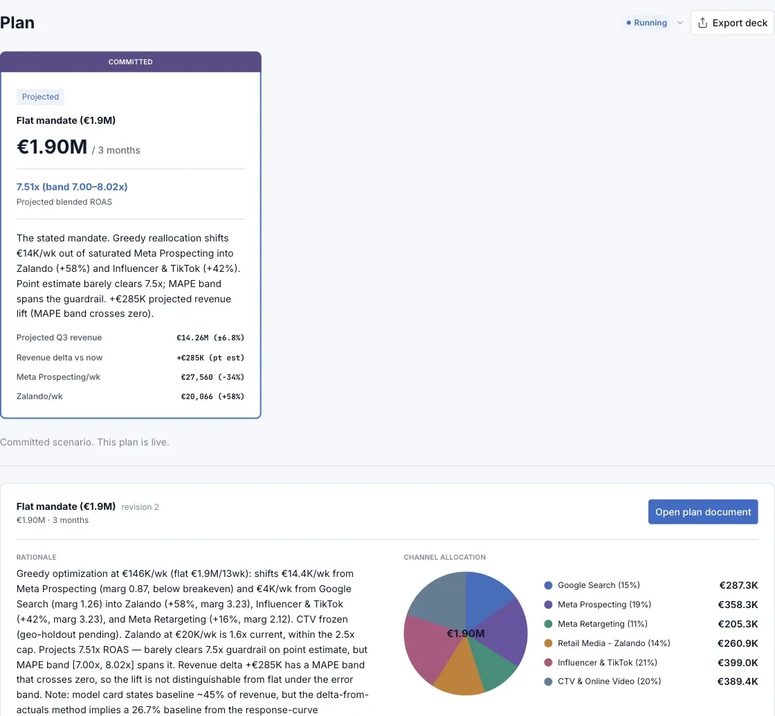
The Plan view in the Media Planner is built on response curves. Scenarios state their projected blended return with its band, and the rationale reads each channel’s marginal return off its curve: “shifts spend out of a channel at 0.87× marginal, below breakeven, into one at 3.2×”. When the band on the projected lift crosses zero, the plan says the lift is not distinguishable from flat.
The Tune view proposes reallocations along the curves and sizes them: how much can move before the receiving channel reaches its own knee. A channel near the top of its fitted range gets a cap, and the plan proposes the test that would extend the curve rather than pretending the model knows.
Pitfalls
Curves end where the data ends: beyond the highest spend the model has seen, the curve is an extrapolation. Treat scenarios that go there as hypotheses.
One curve, one channel, one period: curves are fitted on a period. A new creative, a new competitor, a pricing change can move them. A plan that runs for a quarter should be re-fitted, which is what a continuous loop is for.
Interactions are not on the curve: television lifts branded search. An additive model’s search curve includes some of television’s work. Cross-funnel effects have to be reasoned about outside the curve or modelled explicitly.
Read the band: a curve drawn as one line hides the model’s uncertainty, and every decision that depends on the slope inherits it.
See it in the product